Articles
7 Principles of Icon Design
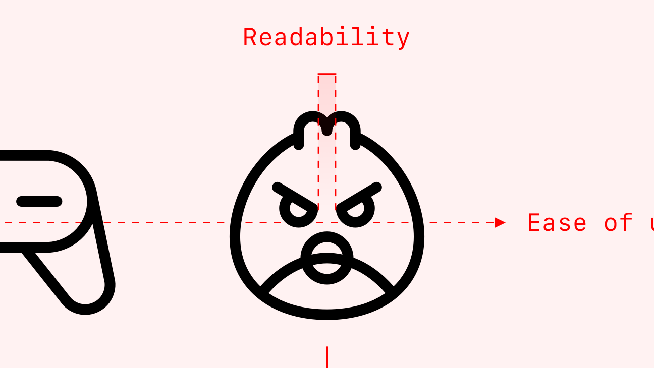
What makes quality icons? Clarity, readability, alignment, brevity, consistency, personality, and ease of use.
3 Classic Icon Families
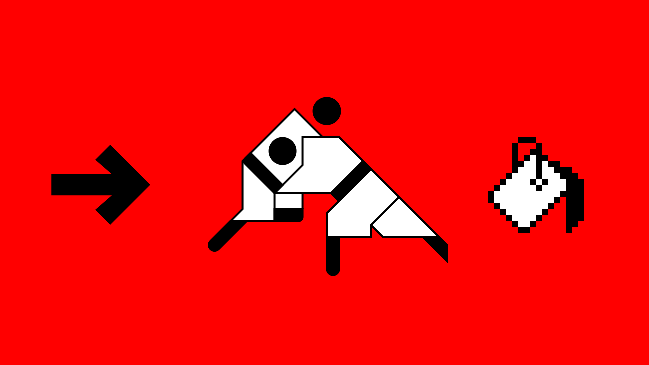
Celebrate the power of iconography through 3 achievements in modern design: Olympics pictograms, Unimark’s design of the NYC Transit System, and the GUI of the original Macintosh.
Icon Grids & Keylines Demystified
A breakdown of icon grids — purpose, anatomy, and in-depth examples from iOS, Material, IBM, and Phosphor for Android.
Foundations of Iconography
What are icons? What are their benefits and what are they used to achieve? Get an overview here.
Design
Phosphor Icons
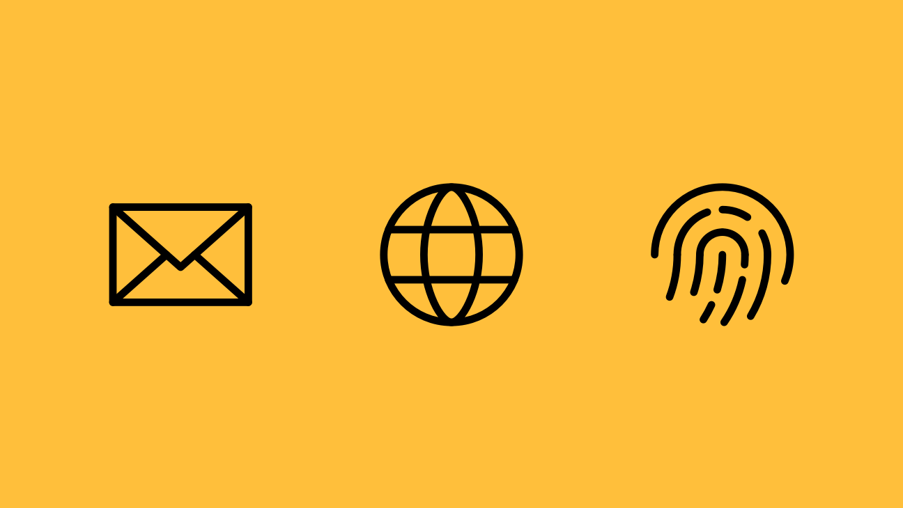
A spin-off of a sister Android project, Phosphor Icons is a flexible icon family for interfaces and more. I collaborated with Toby Fried to build the icon library we always wanted to use.
- 9,072 icons and counting
- 6 weights: Thin, Light, Regular, Bold, Fill, and Duotone
- Designed at 16 x 16px to read well small and scale up big
- Raw stroke information retained to fine-tune the style
- Available for direct download, Figma, React, Vue, and vanilla JS

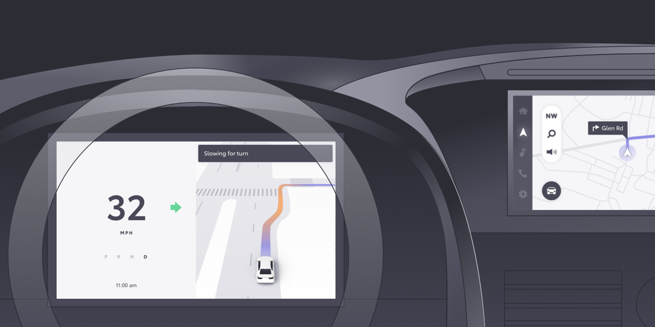
Toyota Research Institute
Toyota Research Institute is Toyota's Bay Area research arm, advancing autonomous driving technology through on-road testing and demonstrations. From 2017 to 2019, I partnered with their UX team to:
- Build demos to showcase research and point of view on autonomy
- Build debug interfaces for Field Operations to test vehicles on the road
- Conduct user studies around safety, trust, and situation awareness
- Solve UX challenges re: vehicle intervention and driver agency
- Imagine the future of multi-modal, AI-powered driving
- Architect principles of behavior for in-car AI
- Unify TRI's internal design language

Waze
Around the world, millions of people use Waze to get to their destination "faster, smoother, safer, and happier." (Source)
Last year, I collaborated with this quirky navigation brand to improve the core product experience and shepherd in a rebrand outlined by Pentagram. We built a home for documentation as well as tools for contributors to get up and running quickly. --REDACTED--REDACTED--REDACTED--REDACTED--REDACTED--REDACTED--REDACTED--REDACTED--REDACTED--.
PayPal
PayPal has been making online payments safe and easy since the early aughts.
In 2019, I helped the design system team refresh PayPal's guidelines from the ground up. We audited design patterns across the org, architected the navigation and page structure, revised the writing, and created new visual aids.
Within 4 months, we brought more clarity to their design language and increased team velocity by 4x.
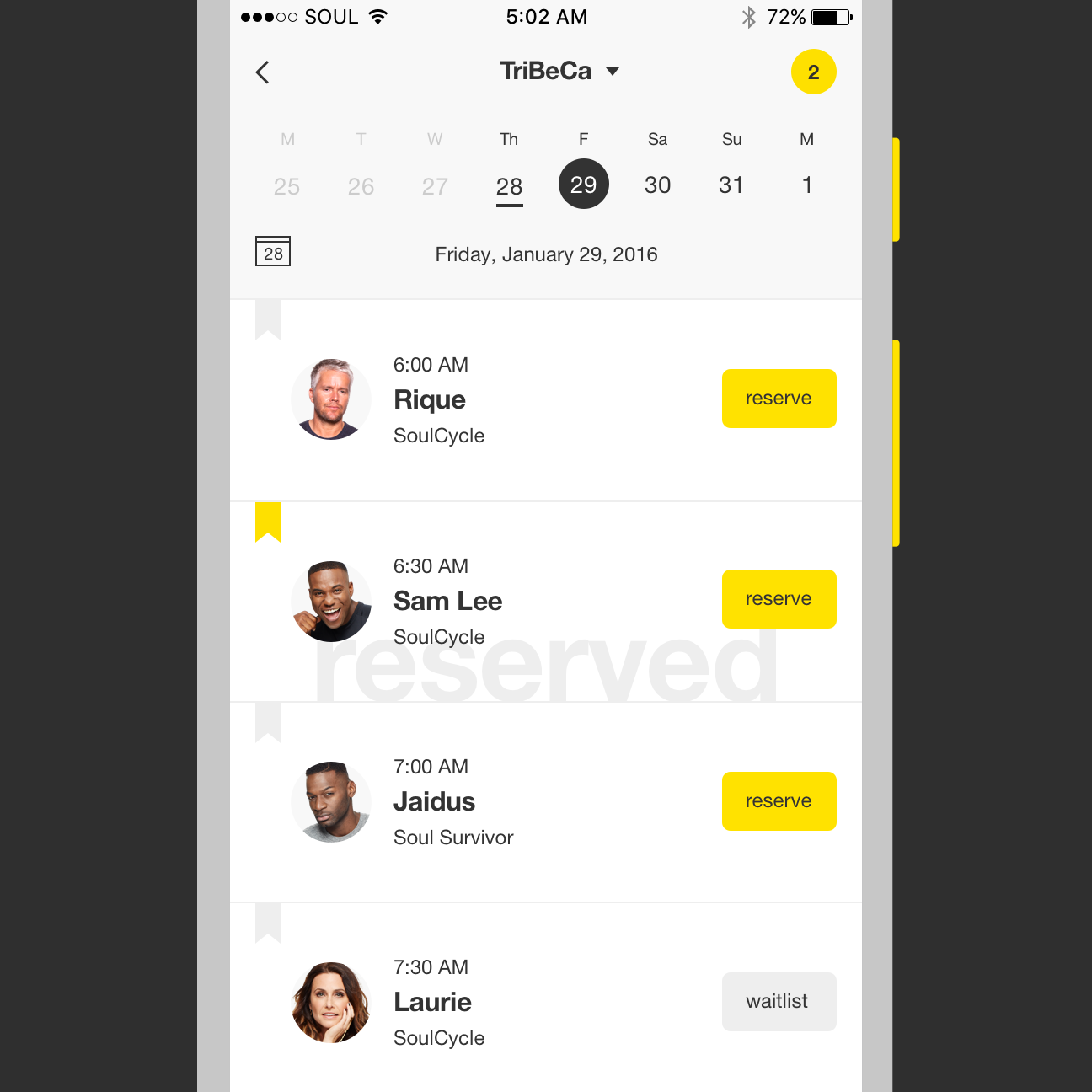
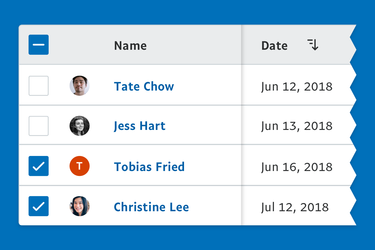
SoulCycle
SoulCycle is a high-energy, boutique spinning class with a cult following.
In 2015 and 2016, I designed for their iOS and web experiences. SoulCycle for iOS created an enormous lift in class bookings, helping riders get out of the app and onto their favorite bike.
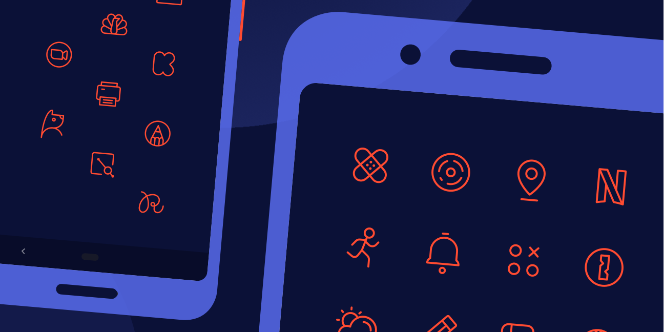
Phosphor for Android
For Android users who enjoy theming their phone, Toby Fried and I created a family of line-style icon packs to achieve a simple, friendly look. Our first release went live in 2019. Today, we provide 900 icons (and counting!) in 4 colors.
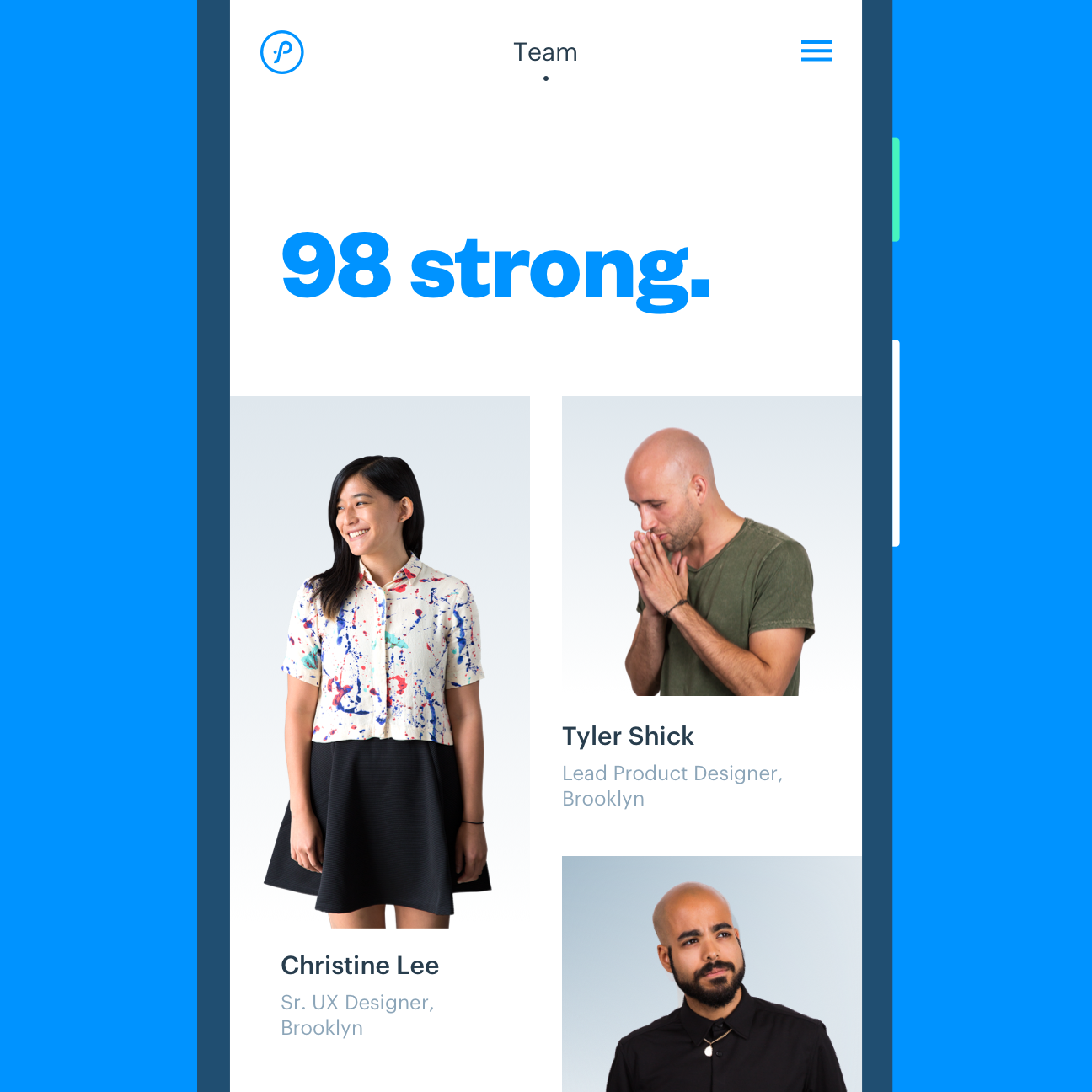
Prolific Interactive
In 2015, I spearheaded a brand refresh to better reflect the spirit of Prolific Interactive, a mobile-focused product agency.
The initiative took us through core values, brand identity, tone of voice, internal documents, and culminated in a new website to showcase our team and our work. We rolled out the refresh in just 6 months.